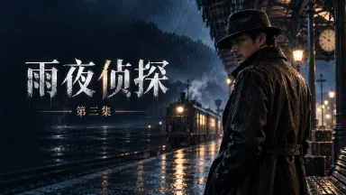
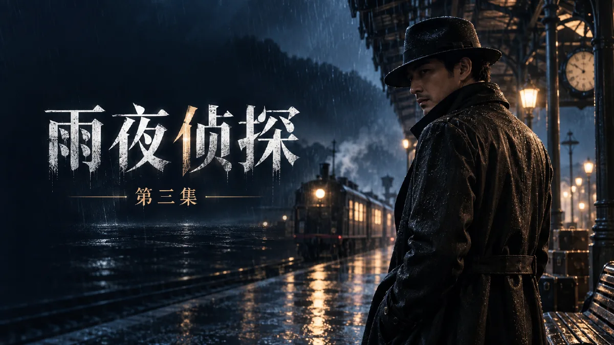
GPT Image 2.5 concept: readable type and layout control Text can now be part of the image workflow, but every cover still needs explicit hierarchy, negative space, and aspect-ratio checks.
A cover can look impressive and still fail in use: the title disappears at card size, a vertical crop removes the subject, or every episode looks like a different series. This guide separates image, typography, and aspect ratio so each can be controlled and reviewed.
The exercise uses our original noir drama Rainy Night Detective. We define the title hierarchy first, reserve a clean type area, then build horizontal and vertical versions from the same character, palette, and story premise.
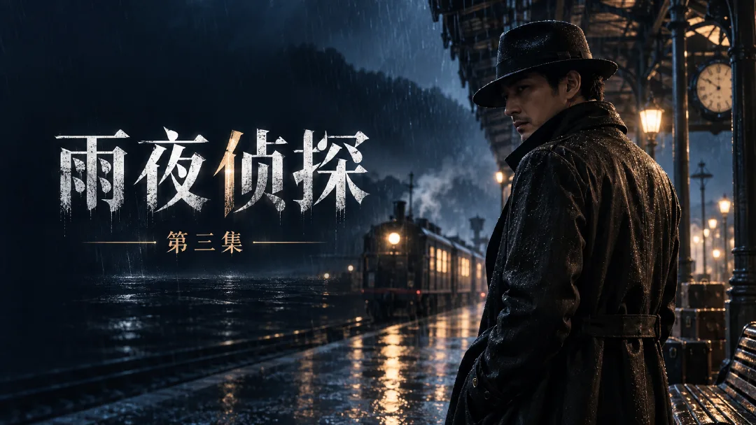
Decide what the viewer should read first
Give one line the primary job. “Rainy Night Detective” is the title, “Episode 3” is supporting information, and a release date is tertiary. They should not share the same size or contrast.
Write an exact copy list before generation and reject extra slogans. For dates, prices, and episode numbers that change often, a text-free background with type added later is easier to maintain.
| Level | Example | Treatment |
|---|---|---|
| Primary | Rainy Night Detective | Largest and clearest line |
| Secondary | Episode 3 | Clearly smaller than the title |
| Variable | New Friday | Separate and easy to replace |
Route 1: generate the image and short title together
Open Arcloop image creation, attach the approved character reference, then specify the exact copy and composition. The reference controls the character; it does not authorize old text from the reference to reappear.
Create a horizontal cover for the original drama “Rainy Night Detective”. Use the reference only to preserve the lead character.
Place the lead on the right in a dark gray trench coat, with defocused rainy station lights behind him.
On the left, show only the large title “雨夜侦探” and the smaller line “第三集”.
Use clear, heavy white Chinese type with strong contrast against the background.
Show only those two lines. Add no English, date, badge, logo, or watermark.
Keep the face, title, and coat collar inside the safe area with breathing room at every edge.
Inspect every Chinese stroke, repeated character, and stray glyph. If one character is wrong, edit only the type region first. If the subject also drifts, switch to the text-free route.
Route 2: build a reusable text-free background
When campaigns change copy frequently, regenerating the whole scene creates unnecessary character and background review. Save a clean series background first, then add type separately.
Generate a text-free background for the same “Rainy Night Detective” series.
Place the character in the right third, preserve the reference identity, and direct the gaze toward the left.
Keep the left side dark blue and low-detail. Rain and distant lights may appear, but must not cross the reserved title area.
Preserve the cool-blue environment with a few warm lights in a cinematic medium shot.
Generate no text, symbols, logos, book spines, or billboard lettering.
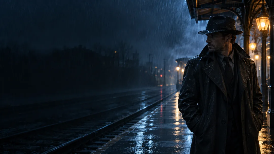
Arcloop Canvas supports text, crop, outpainting, and download. Saving the background first separates “change one line” from “replace the picture.” For exact tracking, brand fonts, or complex type systems, finish the background in a dedicated layout tool.
Recompose instead of cropping from horizontal to vertical
A horizontal cover may place the title left; a vertical cover may need it at the top. A simple crop can remove the message or cut through the character. Choose the required ratio in Canvas and regenerate or outpaint with a new layout.
Use the approved horizontal cover as reference and create a 9:16 vertical version.
Preserve character identity, costume, rainy-night palette, and the main visual style.
Place the lead in the lower middle and reserve the upper quarter as a dark, low-detail area.
Do not stretch the subject, duplicate the character, or squeeze the horizontal title into the vertical layout.
Add no text in this version. Keep the top of the head and shoulders complete.
Plan the square version separately as well. Series consistency comes from character, palette, type, and hierarchy—not from forcing one crop into every format.
Three checks before delivery
Shrink the cover to card size: is the title still readable? Hide the title: does the character still belong to the same series? Compare horizontal, vertical, and square files: did each get a real composition rather than a stretched crop?
Save the clean background, the final typed cover, and an exact copy sheet. Record the type style, colors, and placement so the next episode has a reliable starting point. For tighter spatial control, continue with the sketch-to-storyboard guide.